Feel free to check out the article in question here.
Question & Audience
Well-defined and impactful The core question driving the story is clear: How much destruction has happened in Gaza over the past year? The audience seems to be a general global readership—anyone trying to understand the scale of devastation, including policymakers, activists, and the general public. The piece subtly pushes the audience to acknowledge the sheer extent of destruction without using overtly emotional or political language. Instead, the visuals do the work.
Data & Abstractions
Smart choices, but could benefit from additional layers of context The primary data source is satellite imagery, supplemented by reports from the UN and other organizations. The abstraction method—before-and-after images and damage heatmaps—is effective, but it focuses only on physical destruction. Could have included human impact data (e.g., displacement numbers, casualties, loss of infrastructure like hospitals and schools) to give a fuller picture.
Visuals & Representations
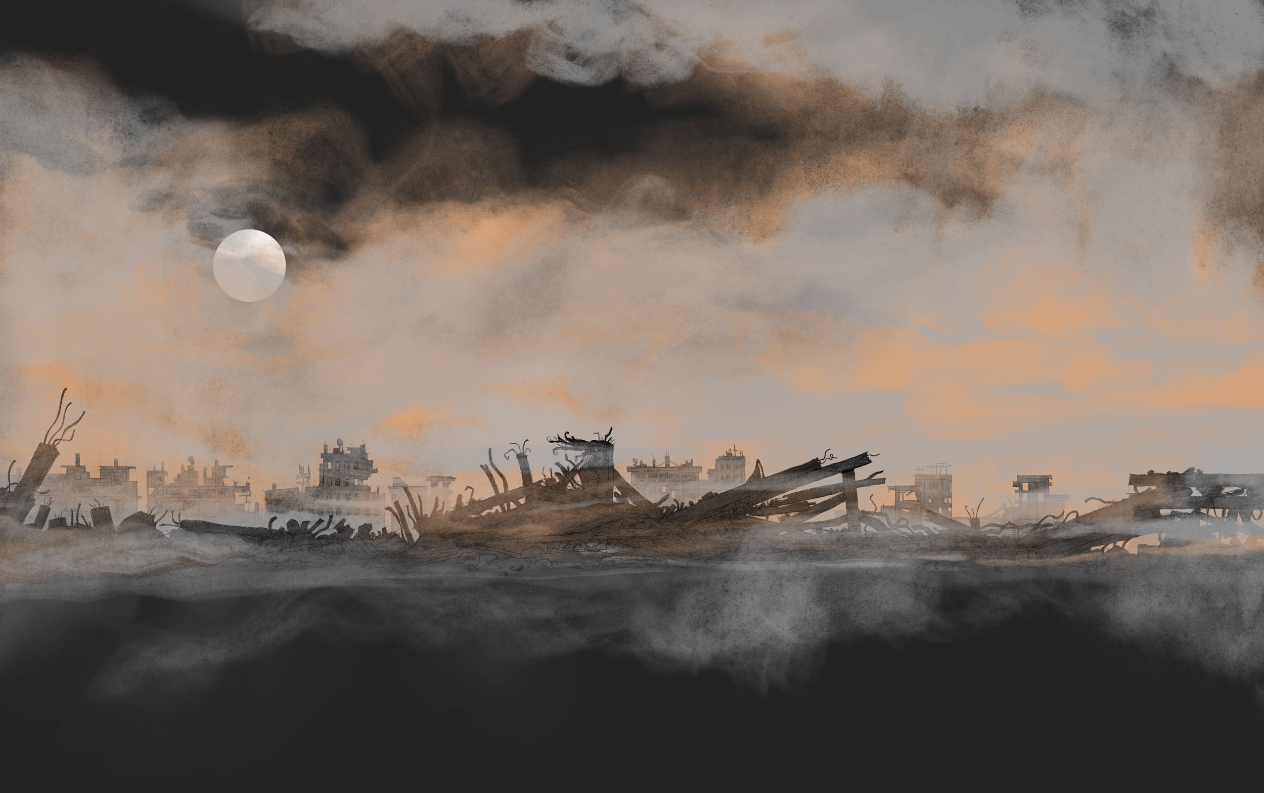
Satellite imagery is powerful, but some representations could be clearer The before-and-after satellite comparisons are the most compelling aspect. The destruction is undeniable when you see whole neighborhoods wiped out. The heatmaps of destruction are also useful but could benefit from clearer legends or explanations of how the data was processed. Could have used zoomable maps to let users explore specific areas rather than just showing static comparisons.
Aesthetics & Design
Minimalist, serious, and effective The dark background with high-contrast images works well—feels like an investigative report rather than a flashy infographic. Text is kept to a minimum, letting the visuals do the heavy lifting. The typography and spacing make it easy to read without distraction.
Framing & Transition
Smooth scrolling, but some transitions feel abrupt The scrolling narrative works well in leading the reader through the devastation, but some sections feel like they jump too quickly from one point to another. More structured framing (e.g., “Here’s a residential area before-and-after,” followed by “Here’s a commercial district,” etc.) could have made the comparisons more digestible. The story lacks a clear ending—it just stops. A conclusion summarizing the key takeaways or pointing to future concerns would have made the narrative more cohesive.
Messaging & Annotation
Concise and neutral, but sometimes lacks depth The captions and annotations stick to the facts, which adds credibility. There’s no unnecessary emotional language. But some explanations feel too brief—for instance, instead of just stating “X% of buildings are destroyed,” adding a note like “This includes hospitals, schools, and homes” would have helped contextualize the impact. Could have used key callouts to highlight particularly devastating areas or compare destruction levels with past conflicts.
Flow & Coherence
Logical flow, but missing a strong ending Starts big (overview of Gaza’s destruction), then zooms in on specific areas, which is a great structure. The transitions feel mostly smooth, but at times, the article jumps from one area to another without enough setup. The biggest issue is the lack of a strong takeaway at the end—after all this destruction, what should the audience understand or do with this information?
Interaction & Engagement
Some interaction, but could have done more The before-and-after sliders are engaging and make the destruction feel real. Hover effects on the heatmaps add some interactivity, but more user control (e.g., selecting specific neighborhoods) would have made it even more immersive. Could have included testimonials or human stories alongside the data to make the impact feel more personal.
Final Thoughts: A Powerful but Slightly Incomplete Narrative
This Reuters piece is incredibly effective at showing the sheer scale of destruction in Gaza. The use of satellite images and heatmaps makes the devastation undeniable, and the restrained, fact-based tone enhances its credibility. However, it could have been even stronger with: More human context (data on displaced people, lost infrastructure, personal stories) Smoother framing and transitions (grouping visuals into clearer sections) A stronger ending (clear takeaway or next steps for the audience) More interactivity (letting users explore specific areas in more depth) Overall, a strong piece that effectively informs but could do more to emotionally engage the audience.